Monday, 21 May 2018

Upholstery take 1 – permanently fixed


Away from blogging for quite a while, I am still faithful to my house project completion. In fact, I wanted to do away with the “wet” activities, such as painting, deep cleaning and installations, before I move to the dry and stain-proof field of textiles.

I was however interrupted by the winter, which left me unable to select a few more neutrals. I decided not to spend the season in another neutral maze and proceeded to (drumroll) soft furnishings!

I do indeed put so much emphasis on that because soft furnishings are what makes a house fit for living. Other than being associated with warmth, cosines, visual pleasure and overall feeling of a completed room, soft furnishings are indispensable for the acoustic comfort of any space.

I specifically bring this last one in, because my project one ended up with a nice tiled floor, has a huge window, is relatively small and I keep the doors preferable open. So, having already sorted the curtains (like in every other room), I gladly proceed to UPHOLSTERY.

While I find myself a reasonably skilled seamstress, the idea of doing something so novel and uncontrollable with fabric has always scared me. Here is how I lost my fear of the draper’s stapler.

1.A few good reads. Well, that is how I start most things – getting inspire and informed, and ultimately not following the rules proscribed in the books. Why’d I still insist on books then? Inspiration is the word. I noticed that for one – my book of choice had a great many examples of finished pieces and they are often of antiquary value. Therefore, I concluded, it should not be a great risk to start with an easy to replace and dispose IKEA items (Remember those fellows? – my precious chests which will become permanent in the dining area can be upgraded to saloon furniture whereas IKEA only sells them as garden pieces)


2.Toolbox. Again, the book may aim to discourage you by showing a myriad of almost surgical utensils. However, when carefully analysed, you’d notice that they are mostly needed for upholstering chairs where the jobs run so deep that an amateur would rather buy a new chair. So – just one new tool needed – the mighty stapler (provided that you already have sewing tools).

3.Materials – ordinary and extraordinary. I feel this is a subject for a full chapter, because other than the technique it is the correct choice of materials which will guarantee your success. 

My choice of fabric aimed to bring the chests in the colour scheme of the room – that is fairly obvious. However, I also wanted a more sophisticated look – therefore I considered from the beginning the use of piping (it is said that when you add piping to a cushion it instantly takes it to a higher level. Feel free to comment on that).

Next, I wanted to use the fabric to unify my sofa with the said chests – a very safe way to create an ensemble from different pieces. Thus – another criterion came by – the fabric should be good for both fixed and removable upholstery.

Finally – I love linen, and this solved it in the decision-making department pretty quickly. I do not however recommend it since it is easy to crease, tricky to saw straight on, and less durable than the synthetic fabrics. Having said that I am glad that the nice people at Max Bloch’s helped me choose the one linen which might answer better to the challenges above.

Lastly – the quantities were another difficult exercise to establish. Basically I had to think of the upholstery as surface area, but be careful not to include the bottoms. I’d also provide a fabric of lesser quality for the parts which are not exposed. So, taking into consideration only the pieces requested, I rearranged the puzzle several times, until optimal solution was found (and must admit to my chagrin – could have done it better if taking the exact measurements of the pieces to cut, that is size plus borders).


As extraordinary materials I’d supply padding, foam and buttons. Watching a number of YouTube videos helped me reduce the choice to what was really necessary. Because it was my first attempt at upholstery, I avoided on-line shopping. It may have been more expensive and time consuming to go to the shops, but the advice from weathered professionals, was indispensable. Another not-do-it-yourself are the buttons – those available with the DIY kits are only meant for very fine fabrics. The price is sadly the same as when ordered in specialised shop...

4.And action! As mentioned beforehand – stapling is clearly easier than sawing. So the work was pleasant and advanced smoothly. I mostly hesitated before cutting fabric (expensive mistakes possible!) and made sure to measure for fit most of the pieces. I may have given the piping more consideration – when cut it doesn’t look good, so it is interesting to initially consider where piping can work in closed loops and therefore not cut ends exposed. Halas – next time!

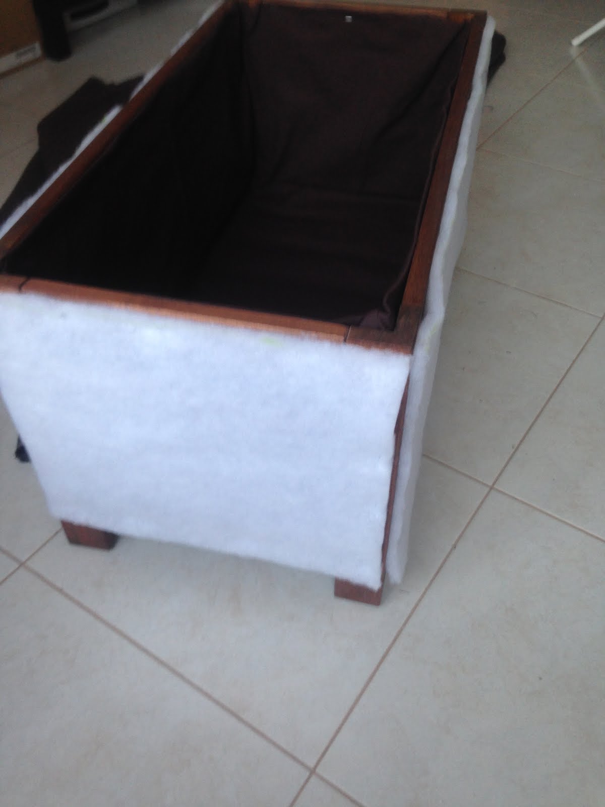


5.Will I do it again? Most certainly yes – in fact the experience makes me fearless of fixed upholstery and am already evaluating other ideas. What next? Removable upholstery is definitely the challenge, so stay tuned!

Thursday, 23 November 2017

Holiday house London - areas to admire, questions to ask

The Holliday House London, apparently first time in London, turned out a wonderful place to visit. Over the grounds of 2 houses in North-West London, 26 designers have created space each.

The experience was breathtaking for a number of reasons. For a start – the project is a charity in favour of breast cancer research. The city’s area is a gem in Britain's capital, so what other chance to go somewhere so nice? Having complete rooms pulled together works far better than a sketch or a show-room – in fact it allows an entry to a designer's mind and lots of inspiration for a "budding" designer.

So, for those who care, my thoughts on what was exposed – for which I have just one word – areas to admire!

1. Bedrooms!

Possibly the dominating theme in those multi-bedroom town houses! Indeed, it was all kinds of directions in style and design – very young even "adolescent" spaces – such as Studio suss (great job), or very masculine, very feminine ones too; very impressive, and well – to some extent some were predictable (at least for me).


Shalini Misra's is one of the more remarkable ones (to me at the very least) I liked the seamless combination of wall paper, textile, furniture, art and details. She'd declared it Moroccan-inspired Marooned in Morocco’ – I saw more of art deco – but enjoyed. This is the key!


Also, the masculine cum tropical theme of Turner Peacock stuck!


Overall, I think providing a bedroom in a townhouse is not too much of a challenge, because the rooms are nicely proportioned – the ceiling height is not overwhelmingly greater as the case would be in Brussels; still the versatility of stiles proves that it is all possible.

2. Dining rooms – speaking of proportions – this came as a surprise, a real weathered well-known name Nina Campbell taught me something: her dining room was magnificent in terms of colours, furniture, textures and accessories. A lot of the pieces though were oversized! I think one may need to practice for some years in order to learn his/her way around proportions. Also – I am sure most of you won't see the difference if those slightly too big pieces were just on paper.


Another dining room I enjoyed was Iggy's- remarkable selection of art, some of the pieces make it difficult to host your kids' party though. The wisdom of this room is that if a place will be used in the evening, and the art and light are well selected – the lack of windows is almost no problem…


3. Living rooms! What a big topic – I am divided between the large spacious ground floor living rooms and the lovely areas adjacent to the kitchens and looking onto the gardens. A very calm intimate space was proposed by Sophy Paterson - in green (one of my most favorite colours) and white. I'd say a good fusion with the nature just behind in glass panes!


The ground floor floor contained a lot of original pieces – chandeliers wall furnishings, furniture, but something was also amiss with the scale – at times the spaces made more allusions of art gallery than home proper - see works of Fiona Barratt.


And this makes me repeat a question I've asked myself and others already many times – how far can training go? Will one who is not raised rich learn the ways of the wealthy just by visiting houses? I think this reaffirms my resolve to work with what I know and aim for the future: learn to organize space well, and make cozy in spite of all space limitations….

4. Random places: there was not a square centimeter of the holiday houses undecorated. There were hallways, bathrooms, restrooms, staircases – In one word all of it. Very important feature as this is what gave integrity to the project.


5.No formal areas – and for that reason my favorites: a dressing room by Rachel Laxer, an exercise by KLC second year students. Probably it is the time to share that am a KLC student too – open learning diploma, so watch this space!


And finally a snug by Natalia Miyar. extremely successful use of space, colours and textures. 


Once I was told that when leaving an exhibition I must know which picture I want to take and hang at home. To paraphrase – this is the vibe I might enjoy. In the end of the day art and design serve the same purpose – I admire them both but also can't stop asking myself – how do they do it? What goes through artists' mind? Could I learn to imitate it?

Monday, 9 October 2017

Colours, shapes and volumes - another series of testing

Colours are easy, shapes not quite so – this is my conclusion.

The present post as an extension to my first testing post, if you would remember it. Once again go on and off the beaten track.


So, on the beaten track are colours. On the following picture you can see extracts from my room in different light. Light is probably the one factor which makes colour testing compulsory and not a single action – try in day light, try with lamps, try on a good and bad day. With dark colours it is particularly tricky, because nuances come out in the bright light of the day strictly.


Initially I toured the curtain shops with a paint chip. To my horror plenty of shops are deep and often the sample they show you cannot be seen in daylight anyway. We had some funny dialogues with shop assistants, which almost made me want to go and check my  eye sight. Luckily a sample can be rented and the colour verified in the exact exploitation conditions.


So, the next step after playing with the sample around the windows – in this in daylight, in shade next to the wall and next to the sheers, was placing and order – and that's it – game set and match.


The testing I find extremely difficult is reproducing a floor plan in an actual room, and that before purchasing the actual furniture. If you go back to my project two floor plan, you wouldn't fail to notice that it is not very orthodox (for those who were made party to my plan at the very least). The reason for placing the bed in the center of the room is that I love symmetry, so it is a natural axe. In addition, with windows on all the external walls, so little space is left for standing items, such as wardrobes. A second reason is that I need to enjoy the view from my bed, and that is one option for it. A last reason is that this layout provides for two mini zones, which can give additional functions to the room – and that is what I want too. So, back to the point – unorthodox floor plan, and multiple warnings – you won't be able to walk around it.


TIP 1
"Walking around it" is precisely what I've been testing those last days – a standard bed 200 by 160 is traced in masking tape, on the floor, and every time I go into the room – with a purpose of course, I try to see how much the "bed" is in my way. It is in my way, a little – and for sure two people in the same room will block the flow in that specific area. I think though that the only possible challenge is that the cut out zone may be underused due to bad accessibility. Also the person using that side of the bed may go grumpy, eventually.

TIP 2
Walk around it and move it a little. This is a test for my dining table – at present a piece of garden furniture, in the most up to date version of project two – a nice, extensible round table – IKEA INGATORP. Another thing I like about it is that it doesn’t have legs – will be much easier to move it around and place chairs around it. But it is also bigger than the present table. The solution is to cut out the shape and see how it fits – it will be a lot of work to trace a circle with masking tape, but a circle can be cut out. 


In fact I worked on a quarter of a circle. I traced it with a pencil and  a string, in the absence of compass. Then from the quarter, I produced the half, and the the other half. As you can see from the photographs – did not have enough of the same paper – but it all worked – the substitute paper is of the same quality. The advantage is that the shape also can be moved in different locations. So, as a result I am very reassured about the round table. I must also open a parenthesis – the exact footprint of the foot was not examined.


TIP 3
And now for the 3D question – how about the volumes of pieces – I may be able to walk around the tracing, but will I bang my knees? Will I brush off and knock off things from table tops? Tip three – use light items you can place in the future spot of furniture – in my case this is a frame for drying clothes – very light and possibly bigger than the intended piece of furniture. Even if it is transparent, I am not quite happy with the volume (planning for a future chest of drawers), so will need to think again. As you can see the purpose of the props well justified – another layer of thinking is activated – I have my doubts, confirmations and complimentary questions.


And now for the reader – have you experienced those issues yourself? What solutions did you explore? Do you find the tips useful?