
Much as I enjoy having found inspiration, time for
work, and obviously benefitting from the abundant summer light, I must try to
stay cool and not rush – many of my recent ideas must be tested in
smaller, palatable steps. That is because I better do the mistakes before they
are magnified.
So, follow me with the presentation of those tests, of
variable success, but undisputable value to the project!
You remember my tiling quarries and worries, and how I
nearly settled for a combination of a plane tile and mosaic-like tile? So, on a
beautiful Brussels morning I headed for the shop, hoping to find that perfect
combination. For a start, few of tiles exposed were really in stock, and then
once you choose and pay and make it to the backroom, they give you a different
product.


I knew it when I saw it (the vendor acted surprised),
asked the right questions and ended up with a take it or leave it situation.
So, I took it and you can see it hereunder… it is good because it is fairly
neutral. It is bad because anyone can produce this combination, while the
original choice had more of a challenge.
Next – my future master bedroom – code name project 2.
At least two big questions right away:
-
The walls
colour
-
The curtain
rails colour

The walls must tie to the wall paper – Kelly Hoppen’sikat in bleu, which was at the heart of the design. However, it is not a simple
bleu – there are at least three different streaks which come together. I’d go
for the closest colour – the brand is Perfection, colour is Atlantik 3F.
Luckily, tests exist, and this is what they are for –
I am not happy with the result – it is a kind of purple. Isn’t it nice to have
this done, before paint for the entire room is purchased?


So, I will move on and do the next test with ShadyPurple A70 from Levis!


As to the curtain rail – after the very successful
copper rail in the living room, I like the one in the master bedroom to be silver – so this is the paint
chip you see next to the wall paper. Once again two choices: the actual silver
is kind of muted, and there is a mirror-quality colour known as chrome – this is
going to be another test.
Next – plan layout – the hundred times re-drawn
project 1! Two things are to be tested:
-
The volumes
– that is the table composition, but the choice of table and seating is
naturally going to be very different

-
The elevations
– old with the new – given that I already have the “old”, I shall place them
where I’ll want to find them before buying the new.


So, for this one, no complaints, second thoughts or
whatsoever – the decision is to go and buy those Billy bookcases.
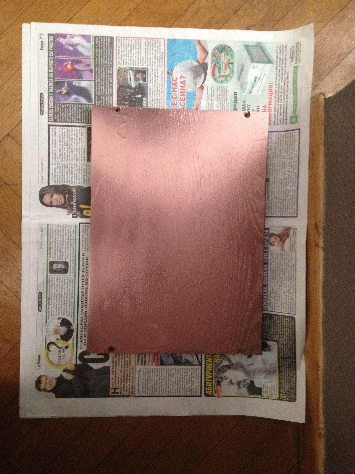
Finally, if you remember from the post – the bookcases
need to be tweaked a little – again this beautiful copper colour. Well, before
spraying the whole thing, it makes sense to check how the paint meets the
surface small scale – here is a single shelf from the bookcase sprayed in
copper. I will only know how to proceed after it is dry.
And this is it – only two days in a weekend – so much
done and nothing completed. Stay tuned, because most certainly the tests will
mature into project results! And don’t forget to leave comments!
No comments:
Post a Comment