
As announced in the previous post – I am swimming
against the flow by working on my project one, while the entire design is not
yet clear. I dare believe some success can be achieved, but let’s face it – it
is resources management and I only have as much time!
So, we know at this point in time that my living room
project is yet undecided in terms of spatial planning, but as colouring there
is no choice – I have to go neutral!
And to the point – I’d like to explore certain aspect
of “neutrals” in the present post.
Back to my ode to small spaces, I do confess some
preference towards Asian design… Now Asian design can mean a lot – for instance
it can be simplistic, or highly ornamental, profess love for small spaces or
embrace grandeur, hyper-modern, or traditional to impracticality…
Therefore, it is interesting to deal with the
“digested” version of Asian design. Trivial as it may seem, but the working
formulas of Asian design are quite well set by Kelly Hoppen (you should
have guessed my direction of thought at the post’s title).
Indeed, she advises on neutrals as a the only logical
backdrop to any colour, or no colour if we so choose. In the case of my future
living room – I have an existing door which matches in colour all other doors;
I have a flooring which ties with some other areas. And that is how two important
elements were pre-decided.
In addition, I ordered a taupe door – wouldn’t I –
feels so safe given the rest? And now I have to accommodate a paint colour
around all these…
To be fair, another crucial advice from Kelly’s work
is the typology of neutral, more specifically what she calls “taupe” – like my
door, and “sand” – well, like my other door. Apparently, they won’t match each
other, even if technically both are neutrals. The reason is pretty obvious –
taupe has a reddish undertone, whereas sand, or beige, or toffee if you will –
is on the colder side of the colour wheel.
So, in between those two doors, I have a tiled floor,
and the marble-like veins also do carry some kind of red. But the floor is
mostly clear, thus good match for any of my doors…
Now, most DIY shops (Brico in Belgium) provide a
selection of samples, and in the neutral range those samples are alarmingly
identical. It is only at close inspection that one sees how none of them is
good.

For a start – they do have some extra colour which distinguishes
them from a “pure” neutral. I.e. once laid against a real neutral they look
bluish, greenish, yellowish.
Then, I also have a problem with colour intensity – I wish
I’d have walls into which my taupe door will blend in, but my oak door won’t
stand out. This rules out colours derivative of white.

Last but not least – the light! The expected spectrum
of possible lights is enormous n Belgium! Actually, my runner-up colours look
almost the same in certain light, or when in the shade, but in the months of
long days I suspect they won’t agree with each other, or with the environment!
Shall I wait for the summer in order to choose?
So, as you can see in the photo here-under – so many
samples, mostly passable, but none of them really good.
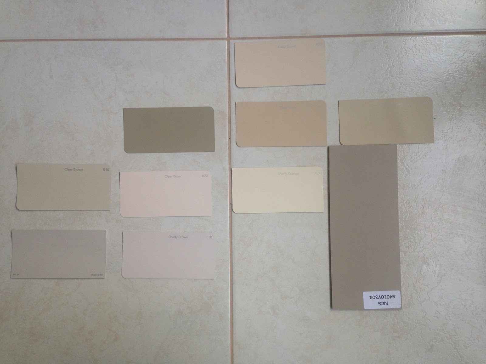
It was easy to weed the ones of wrong colour intensity
– too black or white-like. Then, remove the ones which strongly mismatch either
of the doors…And that is how I ended up with my two runners-up and am still
undecided.
I’d lay them against the doors, and won’t come with
conclusion!


I’d check them in light and shadow – may be is a god chance
for you to check them for yourself: I am hesitating between two clear browns:
A40 and B50. B50 looks more neutral when looked at separately, A40 less agreeable
but seems like the impossible perfect match for the doors.
And here I have to stop, because, I really wouldn’t
know how to pick between them. A possible next step would be to paint larger
surfaces, next to the doors, and see what happens. Interestingly, and you may
have noticed already – the colours from the links resemble each other way too
much! Thus, I shouldn’t doodle either - participants may pick the colour with the
better name.
I still have to work out a method to decide on the
colour before painting the room first option and then the second… My point is –
this is a typical example of how a project is delayed until a decision would
mature.


In real life – I suspect I’d buy a small pot of the
paint which would seem the better choice on a given day, and see where it takes
me.
Do you have a favourite between those two? What would
you do in my place?
No comments:
Post a Comment