The Holliday House London,
apparently first time in London, turned out a wonderful place to visit. Over
the grounds of 2 houses in North-West London, 26 designers have created space
each.
The experience was breathtaking
for a number of reasons. For a start – the project is a charity in favour of
breast cancer research. The city’s area is a gem in Britain's capital, so what
other chance to go somewhere so nice? Having complete rooms pulled together
works far better than a sketch or a show-room – in fact it allows an entry to a
designer's mind and lots of inspiration for a "budding" designer.
So, for those who care, my
thoughts on what was exposed – for which I have just one word – areas to
admire!
1. Bedrooms!
Possibly the dominating theme
in those multi-bedroom town houses! Indeed, it was all kinds of directions in
style and design – very young even "adolescent" spaces – such as
Studio suss (great job), or very
masculine, very feminine ones too; very impressive, and well – to some extent
some were predictable (at least for me).


Shalini Misra's is one of the
more remarkable ones (to me at the very least) I liked the seamless
combination of wall paper, textile, furniture, art and details. She'd declared
it Moroccan-inspired Marooned in Morocco’ – I saw more of art deco – but
enjoyed. This is the key!


Also, the masculine cum
tropical theme of Turner Peacock stuck!

Overall, I think providing a
bedroom in a townhouse is not too much of a challenge, because the rooms are
nicely proportioned – the ceiling height is not overwhelmingly greater as the
case would be in Brussels; still the versatility of stiles proves that it is
all possible.
2. Dining rooms – speaking of
proportions – this came as a surprise, a real weathered well-known name Nina Campbell taught me something:
her dining room was magnificent in terms of colours, furniture, textures and
accessories. A lot of the pieces though were oversized! I think one may need to
practice for some years in order to learn his/her way around proportions. Also
– I am sure most of you won't see the difference if those slightly too big
pieces were just on paper.


Another dining room I enjoyed
was Iggy's- remarkable selection of art,
some of the pieces make it difficult to host your kids' party though. The
wisdom of this room is that if a place will be used in the evening, and the art
and light are well selected – the lack of windows is almost no problem…


3. Living rooms! What a big
topic – I am divided between the large spacious ground floor living rooms and
the lovely areas adjacent to the kitchens and looking onto the gardens. A very
calm intimate space was proposed by Sophy Paterson - in green
(one of my most favorite colours) and white. I'd say a good fusion with the
nature just behind in glass panes!

The ground floor floor contained a lot of original pieces – chandeliers wall furnishings, furniture,
but something was also amiss with the scale – at times the spaces made more
allusions of art gallery than home proper - see works of Fiona Barratt.


And this makes me repeat a
question I've asked myself and others already many times – how far can training
go? Will one who is not raised rich learn the ways of the wealthy just by
visiting houses? I think this reaffirms my resolve to work with what I know and
aim for the future: learn to organize space well, and make cozy in spite of all
space limitations….
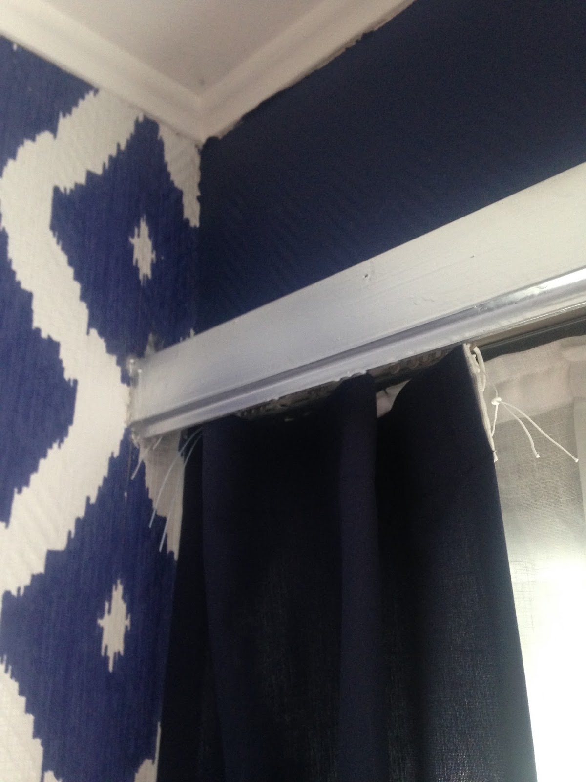
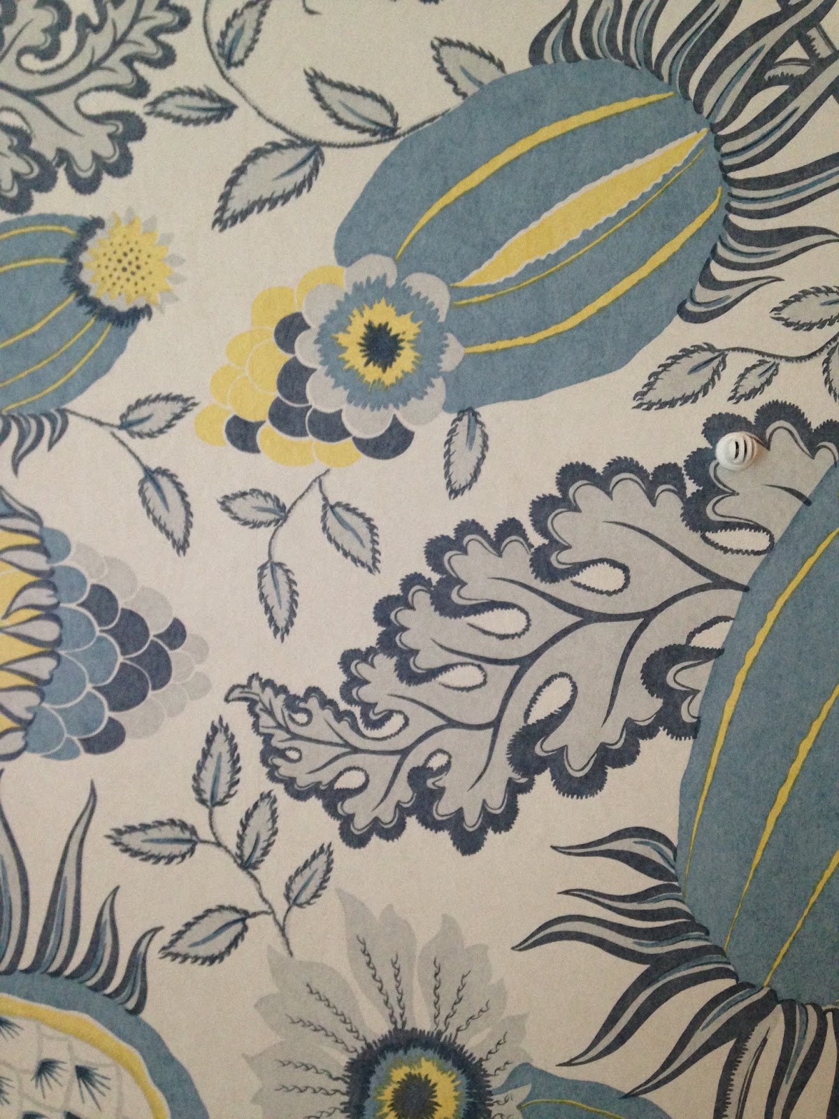
4. Random places: there was not
a square centimeter of the holiday houses undecorated. There were hallways,
bathrooms, restrooms, staircases – In one word all of it. Very important feature
as this is what gave integrity to the project.

5.No
formal areas – and for that reason my favorites: a dressing room by Rachel Laxer, an
exercise by KLC second year students. Probably it is the time to share that am
a KLC student too – open learning diploma, so watch this space!

And finally a snug by Natalia Miyar. extremely successful
use of space, colours and textures.


Once I was told that when leaving an
exhibition I must know which picture I want to take and hang at home. To
paraphrase – this is the vibe I might enjoy. In the end of the day art and
design serve the same purpose – I admire them both but also can't stop asking
myself – how do they do it? What goes through artists' mind? Could I learn to
imitate it?