
The challenge of the present post is integrating a
fairly standard furniture into highly customised environment. Obviously – the furniture
needs to adapt, and it will therefore undergo some “pimping”.
After numerous hours on YouTube, watching videos
dedicated to IKEA hacks and transformations, I can confidently say that all the
alterations fall into three main categories (and that is when the overall shape
of the pieces shall remain the same):
- Change colour – through paint, contact paper,
decoupage, simple wall paper – you name it!
- Change knobs (or other pieces of haberdashery,
if any) – there is so much style in a simple knob! Reminded me of my visit to a
Hollywood studio, where most building decors had no knobs or lights – because it
was pointed out – this is what changes everything in terms of style, period,
you name it.
- Decorate – I have already mentioned o’verlays –
a way to improve the surface of your furniture. But there are also metal pieces
one can add, “mirroring” and what not.
The present is exclusively dedicated to colour
changing. I am happy with the shape – looks like it will fit; knobs, on the
other hand are sooo expensive. I am sure they need changing just as much, in
order to match the style I have decided upon. But seriously – at the price of
5-7 Euro per piece, I may be better off buying new furniture? So, the knob
business will be seen to in a different post. Same goes for decoration – we just
cannot put that much meat on the grill I’m afraid.
Sadly, once again I didn’t manage to cheat myself into
more hand sketching. On the other hand – Sketchup is becoming ever more attractive
and absorbing. So, I will try to give you more pictures and less “talk”.
Just like the neutral’s maze, there is a choice to
make here, so watch out for a twitter poll.
One last thing, before I jump into illustrations:
quickly state my specific goals on this one:
- Any new furniture I bring would be nice to match
the existing pieces, so that my small rooms won’t resemble a furniture warehouse.
- “Japaning” – I like the word, which refers to a
technique from the late 19th century and consisted of lacquering furniture
surfaces, in this case will mean something different. I’d definitely like to
have an Asian touch to this room (project one for the new ones to this blog).
So, I have neutral colours, tiled floor, suspect that red and jet green will
not look so bad in the environment. I just want to “japan” my basic IKEA pieces,
so that they let go of that rustic/Scandinavian feel…
- My main colour of furniture is dark (black/brown)
and the bookcase in the experiment is potentially dark too. Moreover I see it
placed in the darkest part of the room, because I wouldn’t like to be sitting
there myself. So, wouldn’t it be nice to change the colour in a way that it
brings more light?
And with the dark colour in mind the resulting setting
would be something like the following:

BTW, if you wouldn’t know which floor plan this is
showcasing, you may wish to read the post on my latest (and potentially final)
project 1 decision.
Another aspect: it is a view you won’t be able to see in the real
life – we are looking at the room from outside of it. Although in
hand-sketching too, it is a trick often employed, when producing computer
generated images, it looks like a very intentional deceit. In practice, I think
it is not.
You can see that I am not starting the story from the
very beginning, I am just trying to illustrate how a decision emerges, and not
the stages of preparation of all the visuals.
Speaking of visuals – I must admit up to this point in
time I had such a limited experience with furniture making in Sketchup.
Actually I have been frantically looking for ready pieces in the 3D warehouse,
just so I don’t have to build he furniture myself.
Experience proved me wrong, and if you wish to know
where to start – a bookcase looks like a prime beginners’ exercise. So,
hereunder is a scene view (So proud that I also got introduced to scenes
concept thanks to that!)

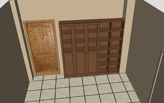
I built the simple Billy 40 by 28 cm bookcase – one module
and started from there. Then I multiplied it, eventually added a door and the
combination was ready. As a first alternative to the dark colour (black-brown
in the uk version of the site), I went for brown ash veneer. This last one also
looked more suited to my mobile sample board, but in reality – I think it may
be a slight mismatch.

It looks like the reddish undertone of the ash veneer is loud
and as a result neither in harmony nor in contrast. For you to judge on this
one.

You may agree that the ash veneer certainly looks
better than the plain black-brown? Check those two and compare. Bear in mind,
the surrounding colours are affected by light/shadow and screen quality. The
one truthful thing with respect to colour is the gradation between different
colours, or so I am thinking.


Next – enter colour! Gorgeous copper, I had already
used on the curtain rail – so pretty certain it is very much in the colour
scheme. Added bonus – it reflects light and is meant for a dark wall! Can one
ask for more?


The following setting therefore was meant to be the
final triumphant picture, one to help me uphold my decision and merrily head
for the stores.


However, just to have the decision making cycle
complete, I’d quickly try the dark black brown, but with the copper background.
What do you think?


I think, it is hard to make an opinion because they
both look goodm and in both cases better than the plain version. So, each one
being an improvement to its previous self, do you have a choice between those
two?


As to myself – the contrasting one looks better. It is
more if a statement, and brings the copper to life. I also feel more
comfortable painting over black/brown and not over veneer – but this is my
feeling. So, unless the concept changes yet again globally, it may be the dark
brown/copper.
For the benefit of the doubt, I give you all four
together:


Please, let me know which is your favourite!
And, this is only the end of part I. In the fallowing
parts I wish to first have something to show. Next, see how it matches my
existing furniture. Lastly – explore more alterations with haberdashery and o’verlays.
If you have any suggestions – I am looking forward to hearing from you!
And as a final thought – I may be tempted to rearrange
the room one final time? (you don’t believe it, do you?)
No comments:
Post a Comment